F
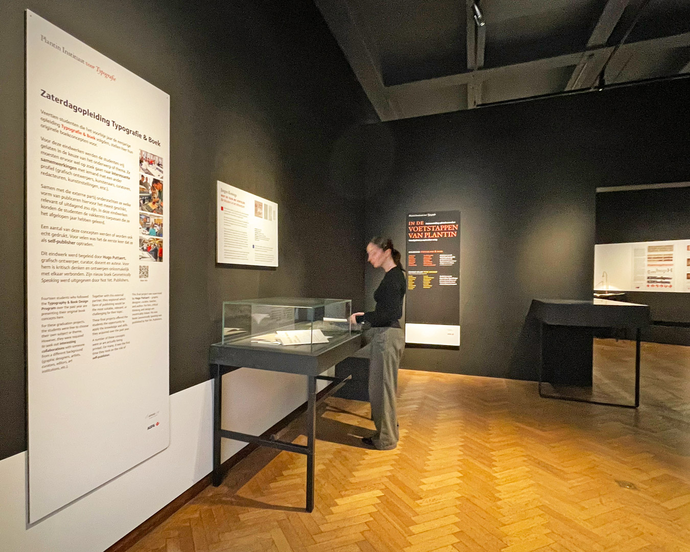
rom Tuesday, July 2, to Sunday, August 25, you can visit the exhibition hall of the Museum Plantin-Moretus (MPM) to view the graduation projects of our students in Book Design and Type Design.
Four Book Design students each created a new design for an existing book about Futurism in Europe. Throughout the design process, they were guided by graphic designer Jurgen Persijn. In this exhibition, discover how the students have incorporated futuristic ideas into their creative designs in their own unique way.
The designers:
Euan Monaghan, Annie Naskyd, Eloise Parrack, and Guðný Sigurðardóttir.
The students come from Belgium, the Netherlands, the UK, and Iceland. The classes ran from December to June. At the start of the course, text and visual materials for the book to be designed are provided. The students explore how to integrate all this information and the various textual levels into a cohesive whole. Researching the many typographic possibilities is a central focus. Additionally, significant attention is given to materials and reproduction methods.
Results Type Design
Our Type Designers Present 19 New Typefaces
These typefaces were created based on typographic heritage and historical prints preserved in the museum. Punch cutters from the Renaissance, Baroque, and modern times were closely examined.
Due to renovations in the exhibition hall last summer, this exhibition features works from two academic years.
Designs by:
Daniel Calders, Đức Cao Xuan, Connie Dispa, Kelsey Elder, Coen Fransen, Katarzyna Friedrich, Alfonso García, Seth Haller, Heather Hobday, Leopoldo Augusto Leal, Agnieszka Małecka, Zofia Oslislo, Diego Garcia Scaro, Kenny Smet, Giacomo Stringa, Louis Theret, Dominik Thieme, Zoë Verstraete, Jeremy Vinson.
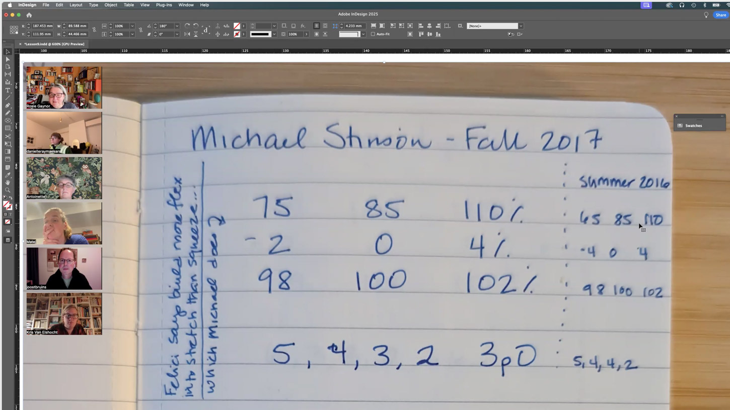
These students hail from across Europe, North and South America, and Vietnam. The Expert Course in Type Design has been taught since 2010 by Dr. Frank Blokland, a renowned Dutch type designer, software developer, and lecturer.
The students tackled several research questions as a group. For example, the 2022–23 cohort explored the relationship between uppercase and lowercase letters and how this ratio evolved throughout history. The work of 14 different punch cutters was analyzed. These studies are presented with photos in the exhibition, alongside original source materials displayed in glass cases.
While we can’t cover all the new typefaces created by the students, four of them focused on the punches and matrices of Hendrik van den Keere. This punch cutter from Ghent worked exclusively for Christophe Plantin during the last decade of his life. The museum’s collection holds many of his type designs, ranging from small sizes (Jolie and Philosophie) to medium sizes (Reale) and display sizes (Ascendonica). One student created a bold Gothic Van den Keere, called the Flamande.
Garamond and Granjon continue to inspire many students. Some stayed close to the original materials, creating stunning Canons intended for titles. Others took a more interpretative approach, referred to as “covers” by Juanjo López. A beautiful italic was designed based on the work of Guyot.
Books themselves also served as inspiration. For instance, a Polish student examined the numerals in Simon Stevin’s renowned arithmetic book, De Thiende. Another used Ortelius’s atlas as a source for unique swash letters. A student from Barcelona delved into the work of 20th-century type designer Emil Rudolf Weiss.
Practical information:
- In the four rooms of the exhibition hall at the Museum Plantin-Moretus (MPM), Vrijdagmarkt 22, Antwerp.
- Until August 25.
- Daily from 10 AM to 5 PM, closed on Mondays.
- Included in the MPM ticket price.
Guided tours
The creators of these works will speak about their projects during guided tours on Saturday, July 6, and July 13. Follow us on social media for the exact schedule.


